


Dental Concepts
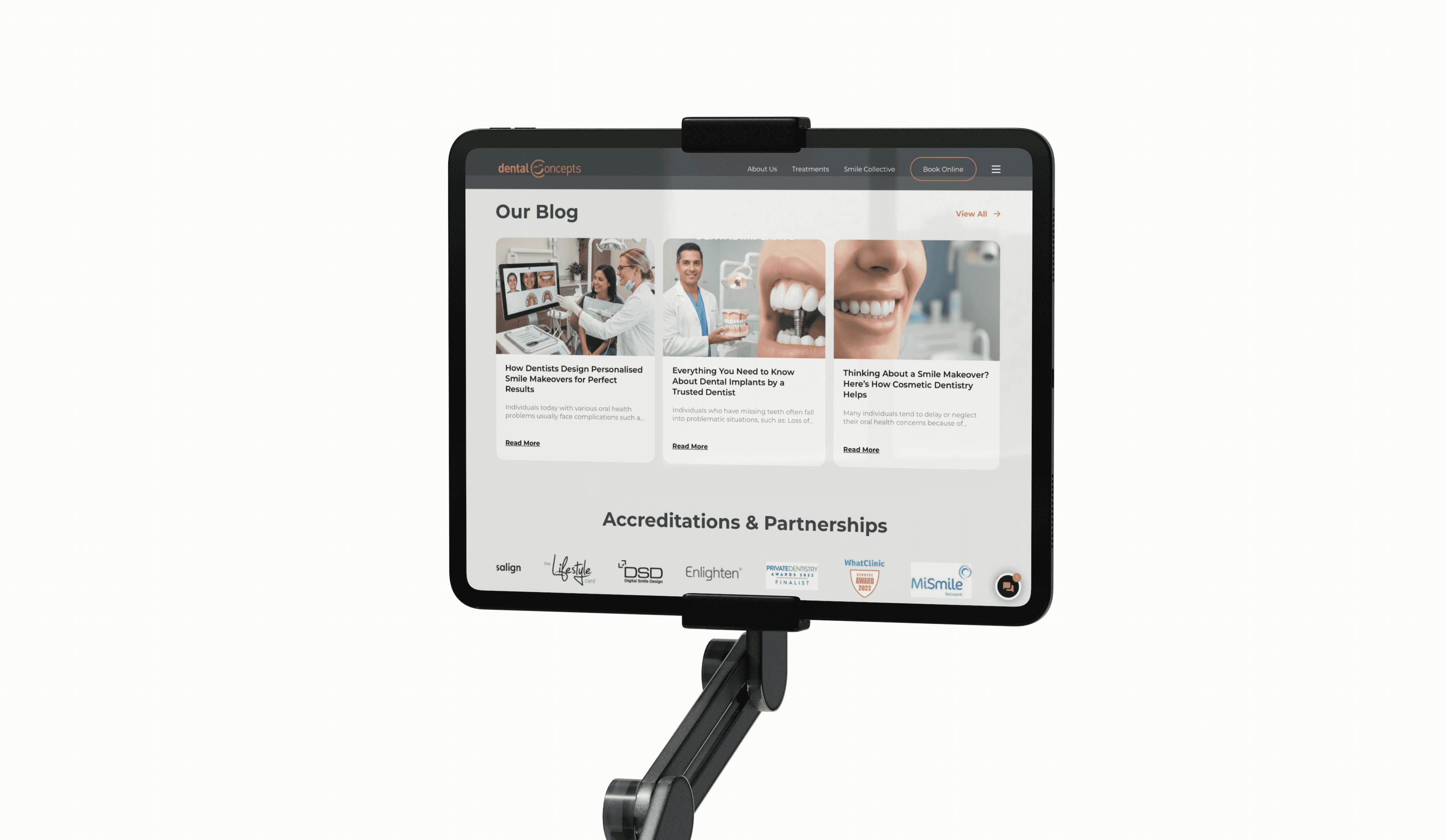
Dental Concepts is a well-established dental group with five practices across the UK. They approached me for design direction after receiving ongoing negative feedback about their website, without clear insight into the underlying causes. I carried out a UX and UI review to assess the site from a user’s perspective, identifying key friction points across the experience. These findings were supported by both qualitative and quantitative research, and translated into clear, practical recommendations to improve usability, clarity, and overall user confidence.
Requirements & Result
The UX & UI review surfaced several key issues impacting user trust and engagement, including unclear navigation, cognitive overload within service content, inconsistent typography and spacing, and intrusive interaction patterns such as the homepage chatbot. These findings were supported by user interviews, heatmap and session data, and analytics showing high bounce rates and low engagement time. The review resulted in a consolidated sitemap, clearer content hierarchy, improved accessibility and readability standards, and recommendations to reduce friction in booking and discovery journeys. Collectively, these changes provide a clear roadmap to improve usability, strengthen brand credibility, and support higher conversion rates and long-term growth, including the expansion into dental tourism.
Client testimonial
“This report gave our in-house design team a clear foundation for developing the website and established a strong baseline for all branded materials moving forward. It has become our go-to reference point for design and UX decisions.”
— Manish Chitnis, Director


Like what you see?
Send me a message! Let's grab a coffee and discuss.
